HTML/CSS/JavaScript | Illustrator | Photoshop | Figma | jQuery | Bootstrap | C3/D3 | XML/JSON | APIs | Datawrapper | GitHub | GeoJSON/Shapefiles | Mapping

Design

Visualizing bat population loss

Illustrator | Figma | R | Graphics | Visual cohesion
The Texas Tribune

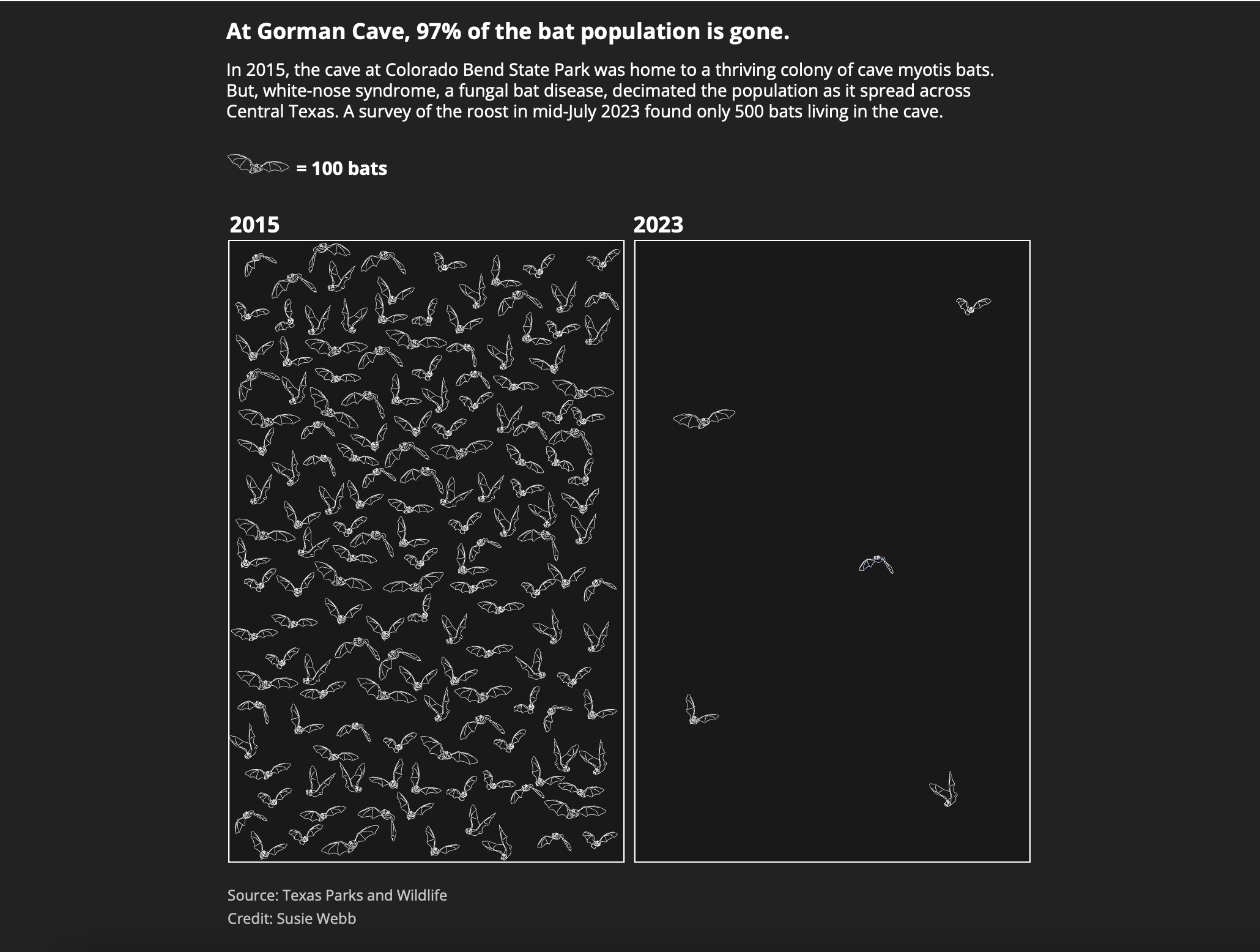
I pitched, wrote, and produced data visualizations for this multimedia story on bat population loss in Texas and its impacts. For the story, I talked to over 15 different bat experts and visited bat sites across the state in order to understand how scientists were combating the loss and the lack of historical data collection. Using Illustrator, I made a graphic with over 500 little bat SVGs in order to demonstrate the population change over time.

Victims of the Washington, D.C., plane crash

Reproducible Design | HTML/CSS/JavaScript
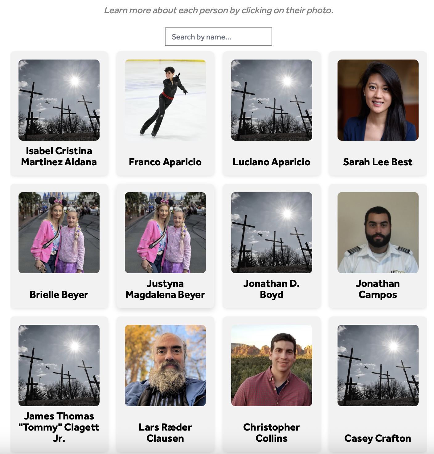
Hearst Television

In the immediate aftermath of the Washington, D.C., plane crash outside of DCA, I created a graphic to honor and memorialize the victims. In the days that followed, I wrote obituaries for the 67 victims of the crash, and spent the following year reporting on air safety and continued near misses.

Tracking executive orders

Interactive Graphic | Design | HTML/CSS/JavaScript | Data
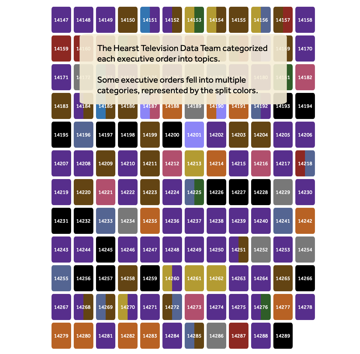
Hearst Television

I tracked and categorized the executive orders under President Trump's first 100 days to determine the focus and initial priorities of his second administration. I also did a deep dive into where the Trump administration's initial actions aligned with Project 2025, something Trump had distanced himself from on the campaign trail.

America 250 project landing page

Immersive Design | Scrollytelling | HTML/CSS/JavaScript

Hearst Television

I built a custom, interactive landing page ahead of the 250th anniversary of the United States to showcase the content and video specials created by stations across Hearst Television.

Visualizing women's movements

Interactive Graphic | Web Design | HTML/CSS/JavaScript | Data | International Reporting
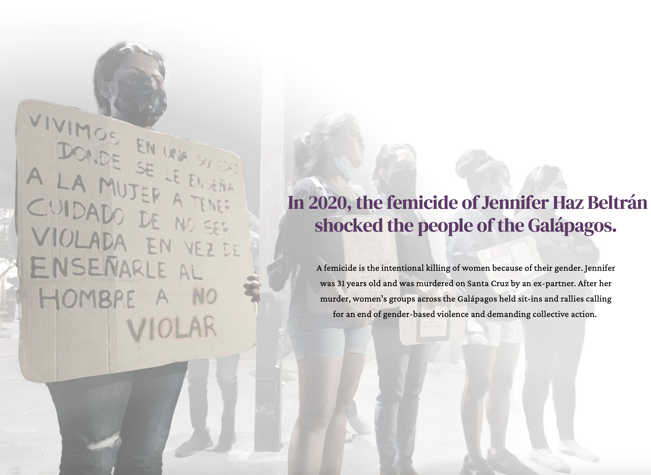
International Projects Team at UNC Chapel Hill

I designed this page and created an interactive scroller and data visualization on violence against women in the Galápagos. The content for the scroller and graphics comes from on-the-ground interviews conducted in San Cristóbal. I also designed the project logo and conducted accessibility reviews of the entire project webpage.

School-adjacent shootings

Web Design | HTML/CSS/JavaScript | Interactive Graphic

Hearst Television

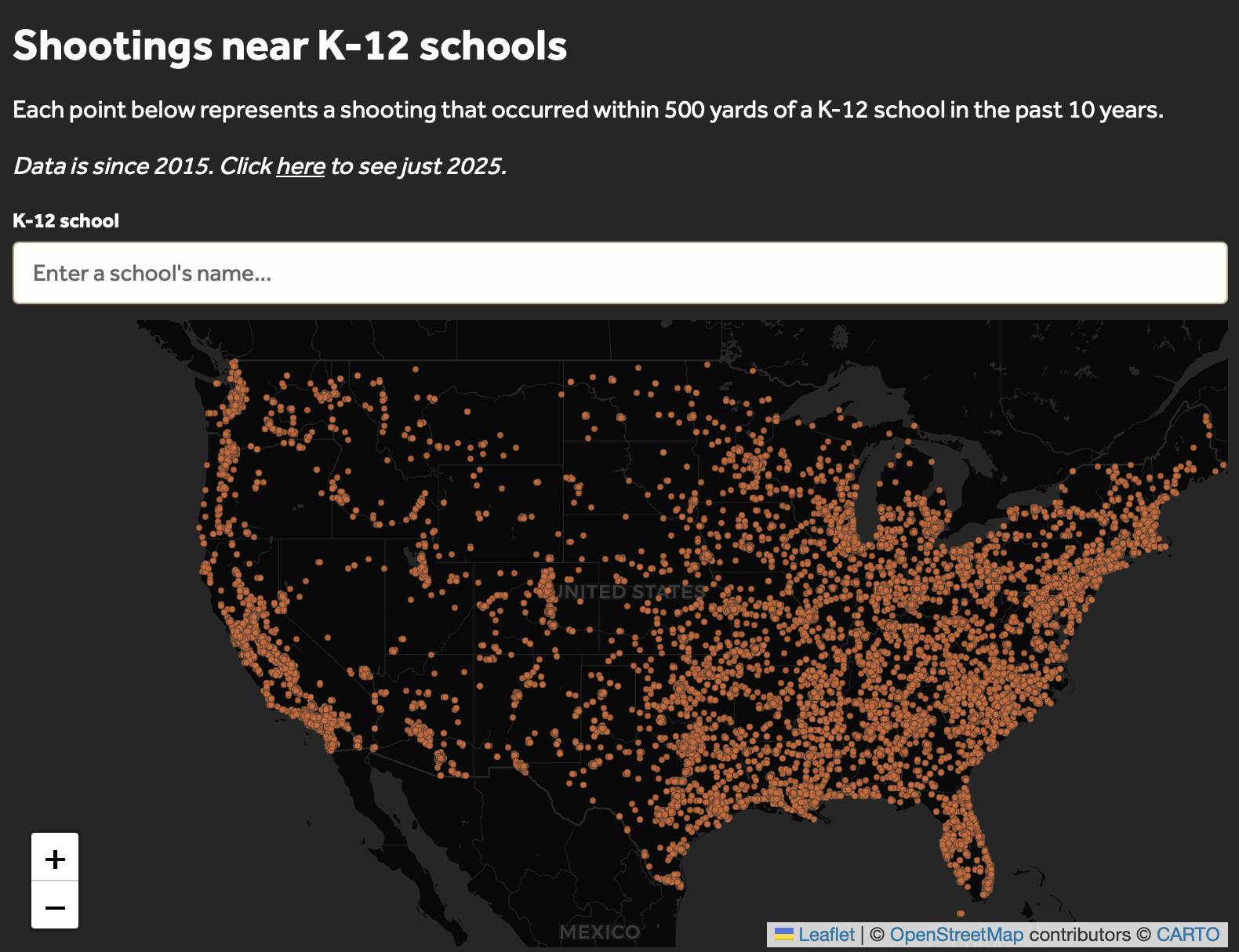
I analyzed 300,000 rows of data on school-adjacent shootings to understand the extent to which America's youth are exposed to violence near their schools and custom-built a school lookup tool to allow audiences to localize the national dataset. In addition to the national story, I worked with individual stations to further localize the data, creating a data memo for reporters.

Do you breathe unhealthy air?

Web Scraping | News App | QGIS | GeoJSON/Shapefiles | Mapping
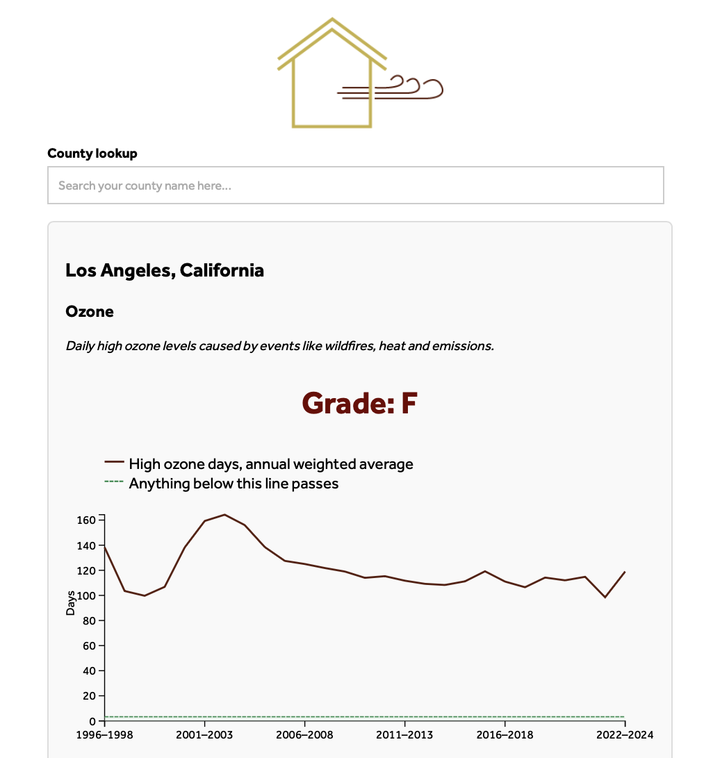
Hearst Television

I created a county lookup based on data from the State of the Air Report in order to localize national data on air quality. The tool allows users to learn about air quality in their own backyards.

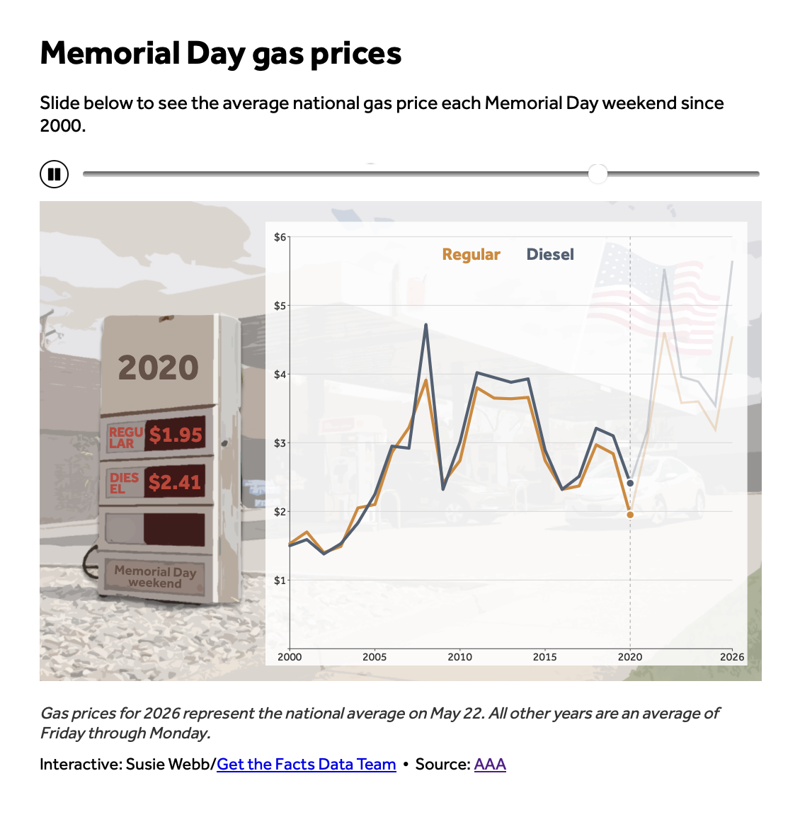
Visualizing gas prices

Quick turn | Photoshop | Illustrator | HTML/CSS/JavaScript | Python
Hearst Television

I built a daily gas price scraper to track rising prices due to the Iran War. For Memorial Day, I built a custom illustration of a gas pump that shows how prices have ticked upwards over the years.

How much is $1 trillion

Quick turn | HTML/CSS/JavaScript

Hearst Television

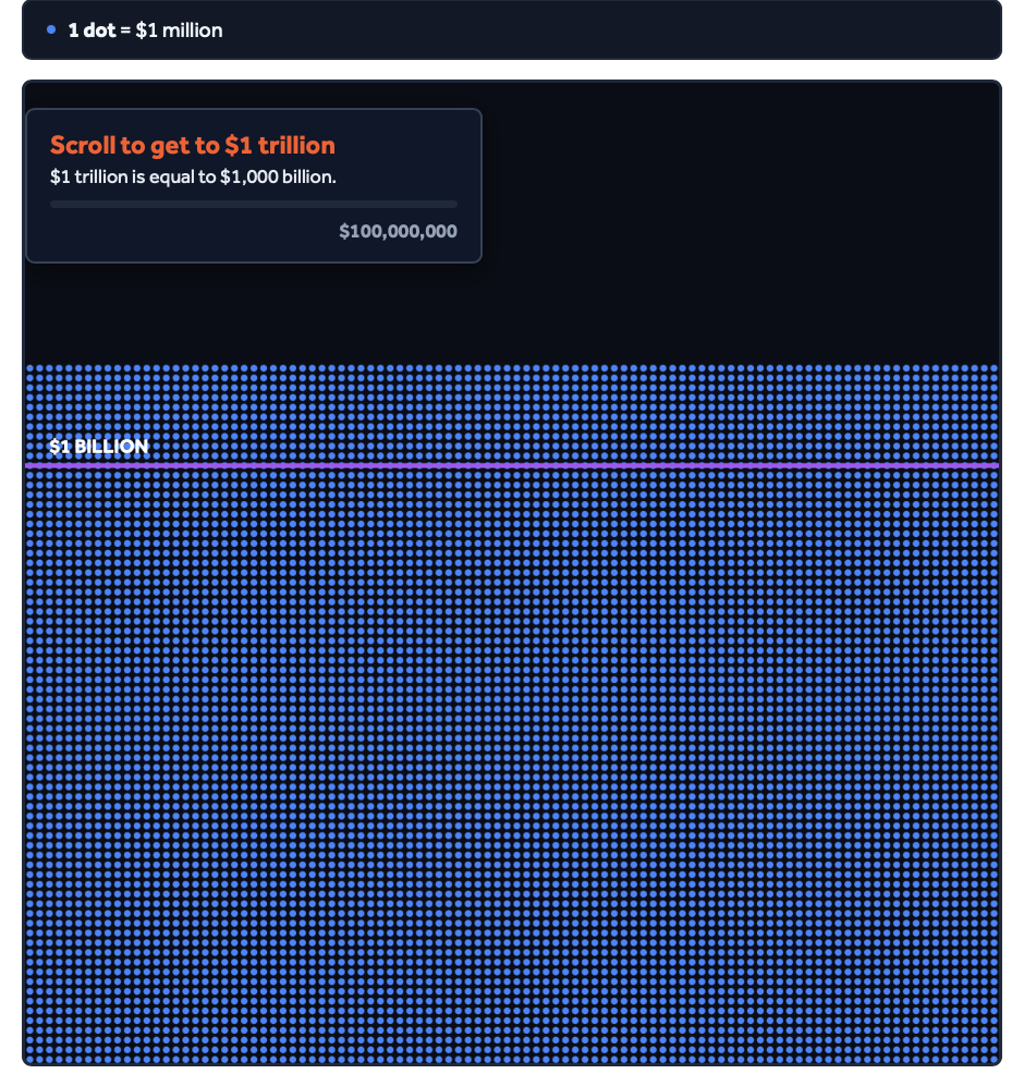
When Elon Musk broke trillionaire status, my team was in the middle of a design hackathon to develop reproducible graphics for our stations. I paused my work and within two hours created a mobile-first scrolling visualization to showcase just how large $1 trillion is. After publishing, I still successfully pitched three designs for the hackathon: a vote tracker tool, a countdown clock, and a visual generator that allows our digital graphics to better translate to broadcast.

Spotted lanternfly spread

Illustrator | AI2HTML

Hearst Television

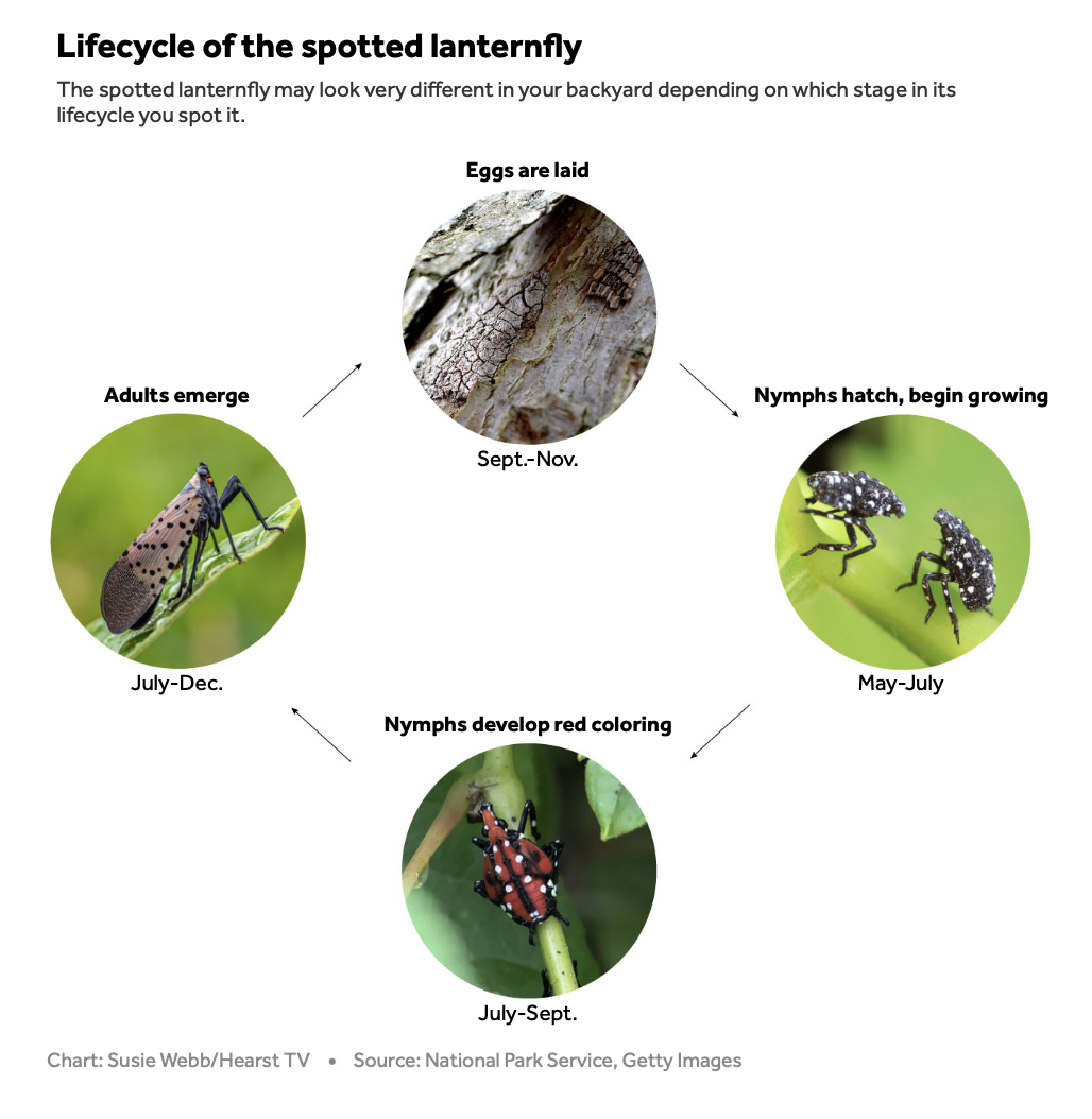
This was one of many illustrations I did for a story on the spread of the invasive spotted lanternfly across the U.S. Using illustrator and AI2HTML, I designed a visual that showcases the lifecycle of the insect and what it looks like in its different stages.